REFRAMING THE REAL VALUE OF ANCESTRAL CRAFTMANSHIP
Raices is a series of itinerant events for handicrafts trade made by indigenous communities in Colombia. Its mission is to enhance empowerment and open economic opportunities for artisans, while they gather together and share their traditions with the public. This is an initiative of Artesanías de Colombia, the governmental institution in charge of handmade tradition preservation in the country.
The brief was the creation of branding, communication strategy and experience. More than a branding-focused project, it was the opportunity to join communication and business design to deliver innovation and awareness about the importance of cultural preservation.
Client: Artesanías de Colombia (in-house)
Type of work: Visual communication and strategy.
Collaborators: Interdisciplinary team
Project length: 2 months.
THE CHALLENGE
-
The creation of a general image and symbol that represents equitatively all indigenous cultures in Colombia, without showing preference for any of them.
-
Enhancing the cultural value behind the commercial offer and keep it accessible for everybody.
-
Staying aligned with Artesanías de Colombia branding, custodying the balance between differentiation and partnership.
THE PROCESS
Since the events’ purpose was not only commercial, but also for raising awareness and extending the safeguard of ancestral traditions, a co-design workshop showed the need to stand out the story and knowledge inserted in each handmade object.
Indigenous crafts are not only valuable for their aesthetics or techniques, but for the narratives that preserve the cosmogony, the traditions, and the daily lives of indigenous peoples; thus, their crafts are their memory books.
That is how raíces, as the Spanish word for roots, was the name selected for evoking the origin of a diverse and pluriethnich culture like it is the Colombian one. Complementing it with the slogan: “encuentro de relatos y artesanías” meaning the meeting of stories and crafts.

Name and logotype design for the events.
The spiral is part of the geometrical shapes representing the precolombina culture and it is a symbol of evolution. This was integrated into the typography, while the accent in the letter i was located for inducing their relation with natural resources, as a bird.


Consequently, with the brand identity, the events' visual communication placed the objects with their native environments narrating a story of diversity and natural resources.
THE STORY


Digital and print ads were designed together with videos and press releases.
Posters, event brochures, invitations, products catalog, tote bags, digital ads, and final project report (picture on the right).
THE VISUALS

We also used public resources from social media to see how life in emergency shelters is.
Sources: IG. @mmuheisen / eltiempo.com
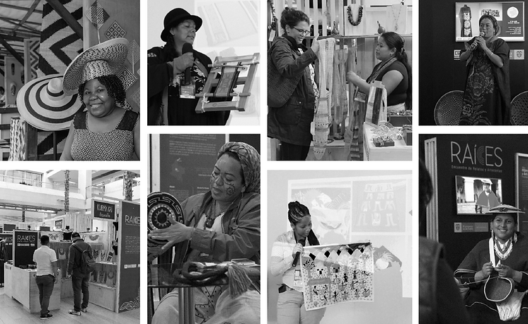
We also had the opportunity to raise public awareness through this initiative with an exhibition displaying the richness of Colombian material and non-material culture.
Additionally, a set of videos for media advertising were made with the artisans' help. This was a collaborative process in which I designed the concept together with the narratives, and manage the production.
The designed material was diffused through national and local media, besides the company's and allies' channels of social media (#somosraíces).
#somosraíces
THE IMPACT

Besides providing commercial opportunities, this initiative is empowering handicraft communities around Colombia to improve their life quality based on the preservation of their cultural heritage.
Raíces, as a communication strategy allowed to position the event for attracting public and media in different cities around the country, which influenced the rise of sales and the events' ownership from the participants.